
Building Products with Accessibility in Mind: Why It Matters for Everyone, including PMs

Accessibility in product design ensures everyone, regardless of ability, can use and enjoy what we create as product managers. As technology becomes a larger part of daily life, it's more important than ever for product teams to focus on accessibility. This isn't just about doing the "right thing" but also designing products that more people can use, appreciate, and benefit from. Here's why accessibility matters and some practical tips for integrating it into your product development process.
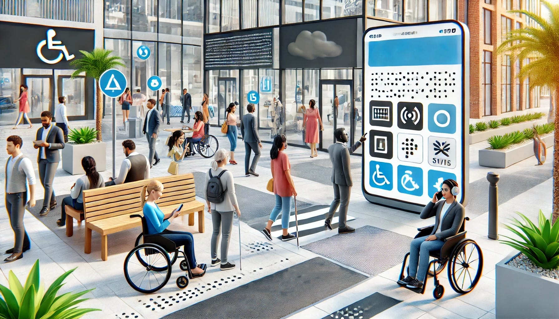
1. Understanding Accessibility: What Does It Mean?
When we talk about accessibility, we mean making sure products can be used by people with various physical, cognitive, and sensory abilities. This can include designing for:
Visual impairments: Low vision, color blindness, or blindness.
Hearing impairments: Partial or complete hearing loss.
Motor impairments: Limited mobility or coordination.
Cognitive impairments: Learning disabilities or mental health conditions that impact focus or comprehension.
These groups are bigger than you might think. About 15% of the global population lives with some disability. Building with accessibility in mind allows us to reach and help more users. If we ignore accessibility, we risk excluding people who want to use our products but can't.
2. Why Accessibility Should Be a Priority
Accessibility isn't just about legal compliance (although that's important too). It's about building better products. When you make your product more accessible, you're making it easier for everyone to use. Think of it like curb cuts on sidewalks—designed for wheelchair users but helpful for people with strollers, bikes, and suitcases.
Accessible design also leads to higher customer satisfaction. Users who find a product easy to use are likelier to stick with it, recommend it to others, and return for more. Accessibility contributes to innovation by encouraging teams to think outside the box and solve challenges that may have been overlooked.
3. Getting Started: The Basics of Accessible Product Design
Accessibility might seem complicated, but starting small can have a significant impact. Here are a few basics to consider:
Color contrast: Make sure the text is readable against background colors. Tools like the WCAG color contrast checker can help with this.
Text size and readability: Use clear, readable fonts and a size that's easy to see. Avoid overly fancy fonts or small text.
Keyboard navigation: Ensure your website or app can be navigated with a keyboard. Not everyone can use a mouse.
Alt text for images: Add descriptive text for images so screen readers can describe them to users with visual impairments.
Subtitles and transcripts for audio and video content: This helps users with hearing impairments and benefits people who prefer to read or are in noisy environments.
Each step is relatively easy to implement and can make a huge difference.
4. Designing with Empathy
To design accessible products, teams must consider users' real-world experiences. For example, a person with color blindness might be unable to distinguish between a red error message and a green success message. Someone with limited mobility might struggle to tap tiny buttons on a mobile app.
One way to build empathy is through user research and testing. Include people with disabilities in your testing groups, and ask how they experience your product. Doing this gives you direct feedback from the people who know you best, which can lead to meaningful improvements.
5. Incorporating Accessibility Throughout the Development Process
Accessibility shouldn't be an afterthought; it should be part of every stage of development:
Planning: Make accessibility a priority from the beginning. Identify specific accessibility goals and discuss how you'll measure them.
Design: Use accessible design principles, such as high contrast, large fonts, and intuitive layouts. Tools like Figma and Adobe XD have accessibility features you can use while designing.
Development: Developers should use semantic HTML and accessible coding practices. For example, use proper heading structures and label form fields for screen readers.
Testing: Test your product with accessibility in mind. Tools like Axe and Lighthouse can help identify accessibility issues. Better yet, test with users who have disabilities to get honest feedback.
This approach ensures accessibility isn't "tacked on" but baked into the product.
6. Common Accessibility Myths Debunked
Let's address a few misconceptions about accessibility:
Myth #1: "Accessibility is too costly." Adding accessibility doesn't have to be expensive if it's included from the beginning. Retroactive fixes can be costly, but building it in from the start is far more manageable.
Myth #2: "Only a few users benefit from accessibility." Accessibility benefits everyone. Features designed for users with disabilities often improve usability for all users.
Myth #3: "Our team doesn't have the skills to implement accessibility." Many resources, courses, and tools are available to help developers and designers get up to speed on accessibility practices.
7. Benefits of Accessible Products
Besides helping people, accessible products have business benefits:
Larger audience reach: By making your product usable by more people, you open up opportunities to reach a broader audience.
Better SEO: Many accessibility practices, like adding alt text to images, also help with search engine optimization.
Improved usability for all: Accessibility features, like keyboard navigation or high-contrast options, can improve the overall user experience for everyone, including those without disabilities.
8. Setting an Example: Be a Champion for Accessibility
Product Managers, designers, developers, and even executives can all be accessibility champions. As product leaders, we must advocate for accessible design, share our knowledge, and encourage others to prioritize it. Educate your team on why accessibility matters, and work to build a culture where inclusivity is valued.
9. Accessibility is an Ongoing Journey
Accessibility isn't a one-and-done process. Technology changes, standards evolve, and user needs shift over time. Regularly review your product's accessibility to ensure you follow best practices. Use feedback from real users, stay updated on accessibility guidelines, and don't be afraid to make adjustments.
Building accessible products is about creating a better, fairer world for everyone. By taking small steps to make our products more inclusive, we create a ripple effect that positively impacts people's lives. Remember, accessibility doesn't just benefit a small group—it makes your product more robust, better, and more user-friendly for everyone.
Whether you're designing an app, a website, or a digital experience, let's build with accessibility in mind. Every user matters, and every effort counts.
Hi Curt!
This is a very important post! Thank you for this! It's always good to be reminded about things we don't consider until we have them or are made aware of them.
Tomorrow I'll include descriptive captions on all my posts. I sometimes do it, but I forget sometimes too. It's easy with ChatGPT nowadays too, so no excuses there - for myself or any product, actually :)
Here's mine, that I try to ensure, apart from the ones you mentioned:
- I went to school with a friend on a wheelchair. We have always been mindful of this growing up, but more especially when doing fire drills. He had to take elevator for a few classes, and when he was upstairs, we had a "tag team" to safely bring him down - the wheelchair wasn't an option. While apps or digital products don't need this inclusivity, the one you mention about keyboards is very much a need for mobile and desktop-oriented solutions.
- I try to ensure our apps are easy to scroll with one hand only, as well as click on and write with smaller keyboards, and that we offer bigger zoom as well - not all people see the same.
- Dark mode is not liked or well-seen by everybody! (myself included). So dark-mode only slides, presentations or apps is not the way to go - even if it is "cool".
- Color-blindness - in Portugal we have a system in our metros made in partnership with a Portuguese association called COLORADD. I was a teenager when this was introduced, and I learned (or was reminded?) that we need to be inclusive for colorblind people.
This partnership shows that accessibility is simple, easy to integrate, people without disabilities can also benefit from it, and in case of doubt, you can partner with associations representing these disabilities :) They'll have no issues helping you get sorted if you're accommodating your product to them too! https://www.coloradd.net/en/co-creation-solutions/public-transports/